Knowing when to use aria-label in HTML is essential for ensuring accessibility. The aria-label attribute helps provide an accessible name for elements like <button>, <video>, and <a>, making them more usable for assistive technologies such as screen readers. However, knowing when to use aria-label is crucial. Misusing it can create confusion, particularly for voice control users.
Developers often use aria-label to add context, especially for interactive elements. While it is useful for elements without visible labels (such as icon-only buttons), we need to be aware that aria-label overwrites an element’s accessible name and it’s generally best to avoid it when a visible label is present.
To understand why, we need to first clarify the difference between visible name and accessible name.
Visible Name vs. Accessible Name
Each user interface element on a webpage can have two names:
- Visible Name: The text or label seen by sighted users.
- Accessible Name: The name that assistive technologies (e.g., screen readers, voice control devices) recognize and use to activate the element.
When an element doesn’t have an aria-label, visible name and accessible name are the same. However,when aria-label is used, the accessible name may differ from the visible name, leading to potential risks especially for voice control users.
Example Scenarios
Wrong Implementation: Using aria-label to Overwrite Visible Label
There are many situations where an interactive element’s label alone does not provide enough context for screen reader users about its function. In these cases, developers often reach for aria-label, assuming it improves accessibility (which it does for screen reader users). However, it’s important to remember that not all assistive technology users rely on screen readers.
For example, voice control users rely on visible labels to interact with elements. When an element is labeled using aria-label, that becomes its accessible name—the one recognized by voice control. However, since this name isn’t visibly displayed, users won’t know what command to say—unless they inspect the element in the DOM… which is hardly the seamless experience we’re aiming for.
Example: The “Learn More” Button
<button aria-label="discover our products">Learn more</button>Let’s take a simple “Learn more” button. We might argue that the text is too generic and that adding more context for screen reader users would be beneficial. If we add an aria-label like “Discover our products,” it would certainly provide valuable information.
But here’s the catch—voice control users now have a problem. Since the button’s accessible name has changed, they would need to say ” click discover our products” instead of just “Learn more” to activate it. And unless they somehow inspect the DOM, they won’t even know that.
As we can see from Chrome’s Accessibility Tab, the value for aria-label is now the accessible name of the element, the one that assistive devices listen to:

NVDA announces the button as “Discover our products” because that’s the accessible name set by aria-label.
Voice Access would recognize the button as “Learn more” (the visible text) but would not be able to activate it by saying “click Learn more.” Instead, they’d have to say “click discover our products,” which is not intuitive.
The best solution? Make the button text clear for everyone.
Instead of “Learn more,” simply use “Learn more about our products” so it’s beneficial for all the users.
If changing the text isn’t an option, use aria-describedby with a visually hidden (sr-only) description like “about our products” to help screen readers without breaking voice control.
The simplest fix is always best—just make the button text meaningful from the start.
Example: Controls with visible label and no aria-label
<button>Sign up</button>Let’s take a simple ‘Sign up’ button as an example. Since we haven’t set any aria-label attribute on it, the visible label automatically becomes its accessible label. This means both screen readers and voice control assistive devices will recognize it as the accessible name of the interactive control.
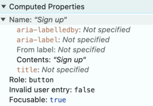
NVDA announces the button as “Sign up,” which is both its visible and accessible name:
Voice Access recognizes the button and can activate it by saying ” click Sign up”:
Example: Icon-only controls
Icon-only controls need a label to be accessible, as there is no visible text to provide context. To make these buttons accessible, it’s essential to provide an aria-label. (Alternatively, you can use the SVG’s <title> or other valid patterns, but since this image is purely presentational, I would rather hide it from the accessibility tree and image navigation)
Let’s take an icon-only link for contacting someone via mail:
<a href="mailto:claudia@codefora11y.com" aria-label="Contact us via mail">
   <svg aria-hidden="true" ...>...</svg>
</a>
If we don’t use any label, screen readers would announce the element only as “link”, leaving blind screen reader users or users with low vision clueless about the link’s purpose. To fix this, we need an aria-labelto make it accessible, like we can see in the computed properties tab.
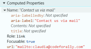
NVDA will announce the link as “Contact us via mail,” which is its accessible name set via aria-label:
With Voice Access we need to activate the link via number by saying first “show numbers” ad then “click <number>”:
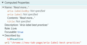
Example: Link with Insufficient Text (e.g., “Read More”)
A link with the text “Read More” is often too vague, leaving users uncertain about the content they are about to access. This lack of context can be especially challenging for screen reader users, who rely on meaningful link descriptions to navigate effectively.
To improve accessibility without compromising functionality, we can provide additional context using aria-describedby rather than aria-label. While aria-label would override the accessible name of the link, preventing voice control users from activating it, aria-describedby allows us to supplement the existing text with useful information without interfering with voice commands.
<article>
  <h2 id="headline">Aria-label best practices</h2>
  <p>...</p>
  <a href="/aria-label-best-practices" aria-describedby="headline">Read more...</a>
</article>
<article>
<h2 id="headline">Aria-label best practices</h2>
<p>...</p>
<a href="/aria-label-best-practices" aria-describedby="headline">Read more...</a>
</article>In the computed properties tab, we can see that the link’s accessible name is ‘Read more…’ (from its visible text), while the description ‘Aria-label best practices’ comes from aria-describedby. This ensures that screen readers provide additional context without overriding the link’s name, making it both accessible and functional for all users.
NVDA will announce the link as “Read more, link Aria-label best practices” which is a combination of accessible name and description set via aria-describedby:
Voice Access will be able to activate the link via its visible label because aria-describedby does not affect the accessible name of a component:
Key Takeaways
-
aria-label isn’t always the answer. It’s an important tool, but it can easily cause confusion if used incorrectly—especially when there’s a visible label already in place. We don’t want to create a situation where voice control users or others relying on assistive tech are left in the dark.
-
Know when to use aria-label, and when to step back. If the element already has visible text, you may not need an aria-label at all. If it’s missing context, though, consider using aria-describedby or enhancing the text itself, so all users can benefit.
-
The simplest fix is often the best. Instead of overloading your elements with too many ARIA attributes, focus on making your visible labels as clear and meaningful as possible for everyone. This approach works for screen reader users, voice control, and everyone in between.
Remember, it’s easy to overlook these small mistakes, but fixing them can go a long way toward making your site more accessible. By keeping things simple, clear, and intuitive for all users, you’ll ensure that your interactive elements work as seamlessly as possible, whether someone’s clicking with a mouse, using voice control, or navigating with a screen reader.
So, before you add that aria-label, ask yourself: Does this really make things clearer, or am I just complicating things? If in doubt, try improving the visible text instead—it’s a solution that benefits everyone.